By Rachael Steven 09/05/2014
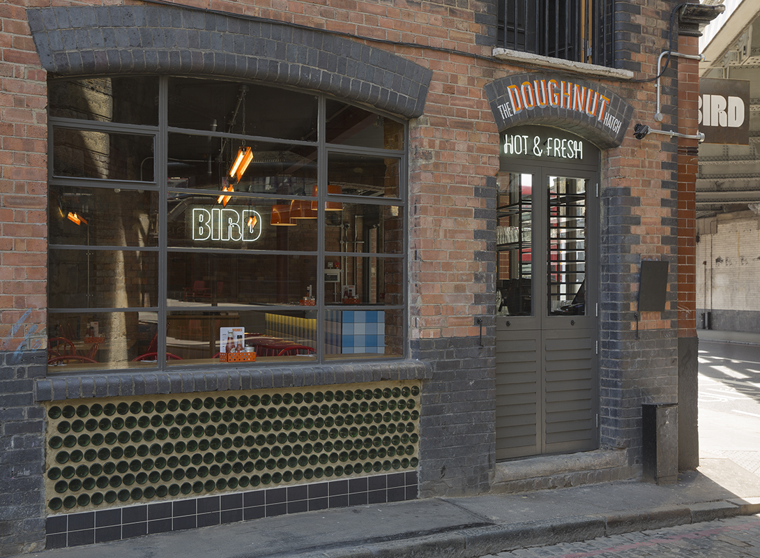
Creative director Paul Cohen has designed branding for a new restaurant in London that aims to challenge perceptions of fried chicken as a low quality snack.
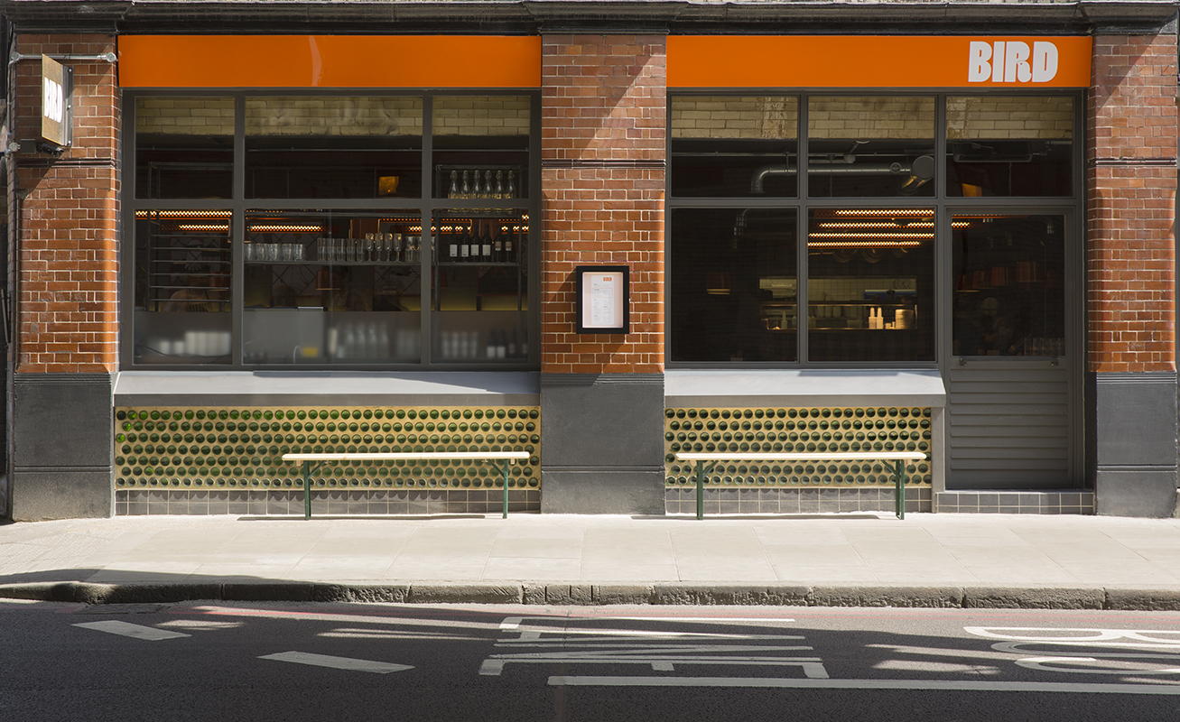
Bird opened in Dalston this week and serves gluten free fried chicken sourced from British farms. Owners Paul Hemings and Cara Ceppetelli say it’s inspired by venues in Chicago, Philadelphia and Brooklyn, but with a British twist. “We didn’t want to parody Americana, our agenda was to put together a very British take on these great local restaurants,” adds Hemings.
Bird’s identity is based on the concept of ‘Free Range & Fried’, says Cohen, which underpins its colour palette, style and interior, designed by Michael Marriott. “It describes what Paul and Cara set out to do, in terms of the product and how it’s prepared..but it’s also a brand attitude – it’s a version of ‘naughty but nice’,” says Cohen. “They wanted to create a comfortable, casual space where people can enjoy good comfort food that’s still fried, but much better for you than at, say, a fast food outlet,” he adds.
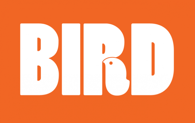
The restaurant’s logo features the brand name in Poplar, a typeface designed by Barbara Lind and based on 19th century wood type. The leg of the ‘R’ has been replaced with a bird symbol. “Poplar is quite idiosyncratic, in part due to the narrow slits that make the counter in each letter”, says Cohen. “Being able to make a hole in the R to reveal the bird was a bit of a gift and it stuck,” he adds.
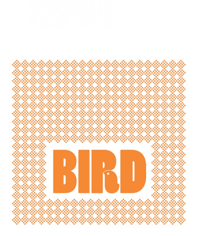
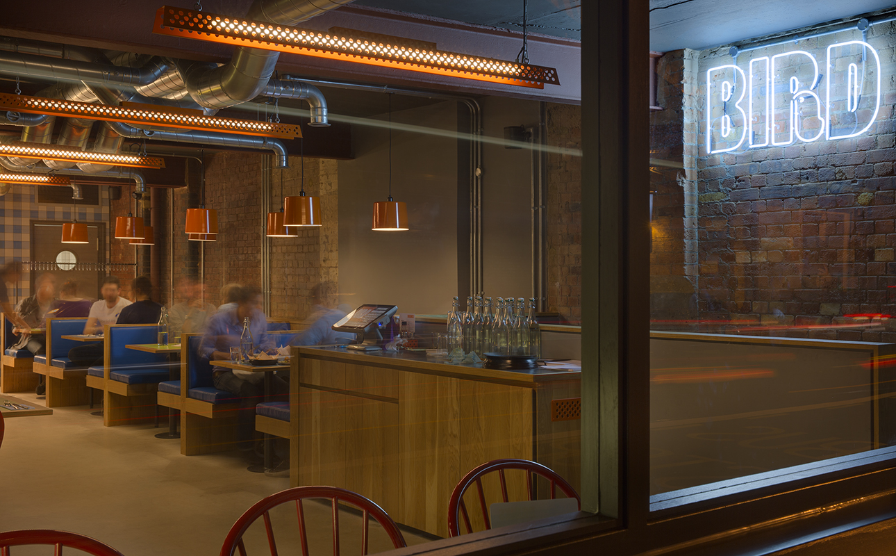
The bird symbol has been used to create a series of patterns, which have been applied to the restaurant’s floor, menus, condiment caddies and custom-made Formica tabletops (above), as well as the greaseproof paper that chicken is served on. Marriott’s light fittings and repurposed chairs have been coated in glossy oranges and reds to look as if they have also been ‘fried’, says Cohen. “It’s all designed to look bright, shiny and crisp – everything’s been glossed, shellacked or powder coated,” he explains.
Illustrators Jim Stoten, Marcus Walters and Matthew Green have also designed a series of prints (below) for the restaurant, which are hung on walls in wire news stand frames. Cohen says illustrations will be updated on a regular basis, and the restaurant is keen to work with new creatives.
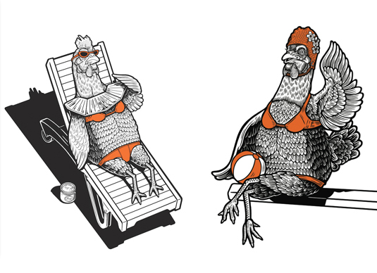
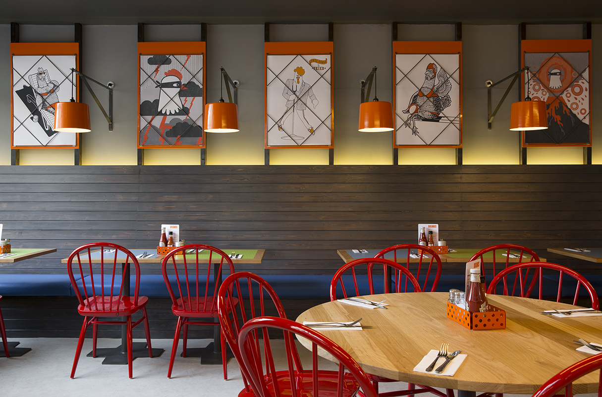
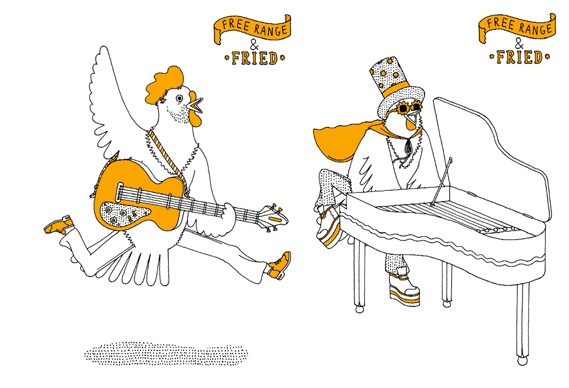
“Over time, the plan is to build a roster of illustrators and an archive of their designs. I really enjoy working with people who have their own distinct style. Jim, Matthew and Marcus have done a great job of adding a playful, homely style to the space, the rest of which is quite pared back and functional,” he adds.
While branded touches appear throughout, Cohen says it was important to ensure this was done tastefully. “With some food outlets, the logo is everywhere. It feels like a shrine to the brand and it’s quite overwhelming. We wanted to remind people were they are, but through subtler elements such as patterns, graphic devices and a strong color scheme,” he adds.
Cohen’s identity is bold, fun and very different from most high street chicken shops. (If you’re keen to find out more about chicken shop signage, you can read our interview with ‘Mr Chicken’, aka sign maker Morris Cassanova, here). Gourmet burger and BBQ restaurants have been popping up in London for years and if Bird proves a success, maybe fried chicken will be the next big US food to get the hipsters excited…