By Emma Tucker 25/05/2015
These Fast Food Joints are so Well Designed You Might Actually Want to Eat Here Why a new wave of food entrepreneurs are working with designers from the get-go
Fast food isn’t meant to be a gourmet experience. It’s about speed, ease of consumption, and of course that lingering feeling of culinary guilt. So it’s hardly surprising that the kind of graphic design you find in this world is often equally lacking in nutrition—of the visual kind.
Branding success stories aside (the golden arches and the like), there’s still a sense of homogeneity around fast food companies, and their disappointingly repetitive visual identities. In London in particular, fast food outlets are clearly marked by their lookalike shop fronts and signage, so much so that in 2009 Creative Review uncovered the story of “Mr Chicken,” the man responsible for designing the signs for most of the chicken shops in the UK.
While major brands may fail to push the envelope, there’s a new wave of fast food entrepreneurs that are willing to take a risk, resulting in some surprisingly forward-thinking graphic design work. Paula Scher’s Shake Shack identity proved that investing in a well-considered identity is more than a matter of style, it’s a smart business move; her work is widely acknowledged to have played a hand in Shake Shack’s recent $1.6b IPO.
“In order to stand out amongst the fierce competition, food brands need to work closely with their designers for a better visual system,” notes Shaoqiang Wang, author of Eat & Go: Branding & Design Identity for Takeaways and Restauraunts.
“Legibility and clarity are basic rules when it comes to food. Individuality and creativity are likely to make your brand remembered by more consumers.”
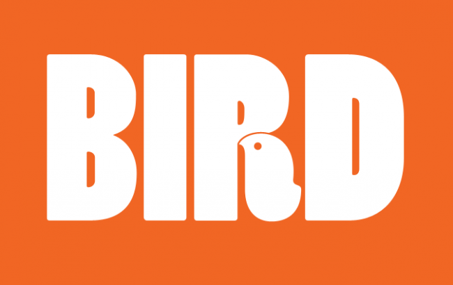
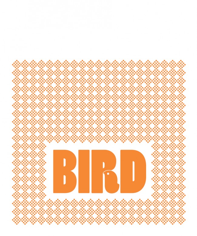
Younger fast food brands show no reluctance in displaying that kind of individuality. London’s one-year-old fried chicken joint Bird caused a stir when it unveiled its bold and bright identity by Paul Cohen, who created a thoroughly British take on an American visual tradition. Typographic trickery is at the heart of the design, taking Barbara Lind’s Poplar (apparently based on 19th-century wood type) and turning the leg of the R into a bird motif. The same graphic appears in the restaurant’s interior and on its menus, even on the paper the chicken arrives in. “With some food outlets the logo is everywhere. It feels like a shrine to the brand and it’s quite overwhelming,” Cohen commented in an interview with Creative Review. “We wanted to remind people where they are, but through subtler elements such as patterns, graphic devices, and a strong color scheme.”
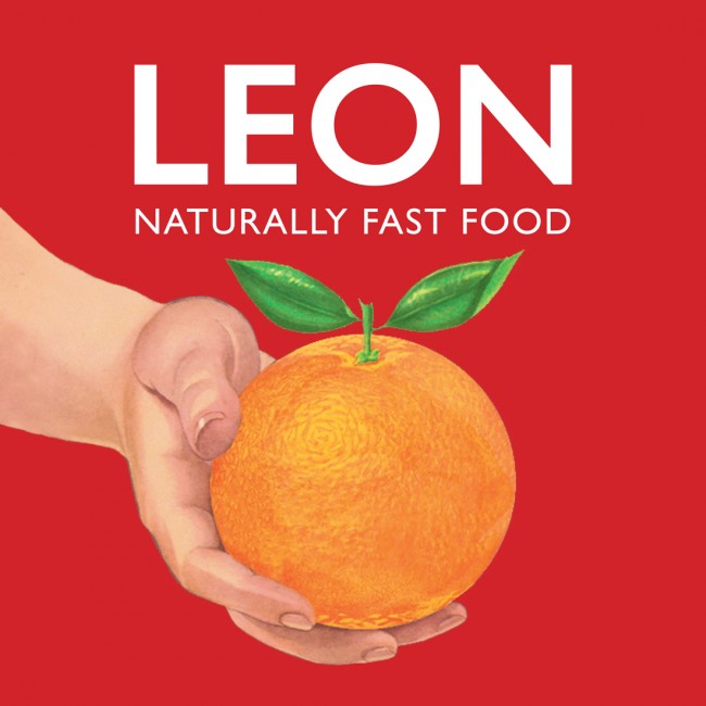
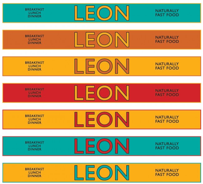
Food chain Leon has mastered of the art of a clear visual language. Its deft use of color and pattern is unified across restaurant interiors and print materials, and its attention to the minor details is impressive. “Although our design is not rigid and prescriptive, we retain classic brand imagery that easily lends itself to new surroundings,” commented head of design Jo Ormiston, speaking to YCN. “The orange, the bull, and the Leon ladies all have an iconic, classic quality to them that makes Leon feel timeless, not retro. We have no one specific logo or fascia—by keeping the brand flexible, we’re able to create a natural feel. The brand, ironically, would be inconsistent and unauthentic if we tried to have rigid guidelines, brand colors, and identical interiors.”
Of course it’s not just London that’s showing signs of an emergent foodie visual language; Barcelona’s Ham On Wheels worked with studio Forma & Co to develop a refined typographic identity for the sandwich shop. Barcelona burger outlet Bacoa also turned to the world of type, working with TwoPoints.Net on an identity that references ’70s Spanish bars, which often used condensed sans-serif typefaces cut from acrylic glass. “The color scheme of these bars is very limited. Usually the boards, napkins, and doilies are only printed in two colors: red and blue,” the studio explains. “We also tried to embrace the sometimes amateurish design, which gives a typical Spanish bar its own charm.”
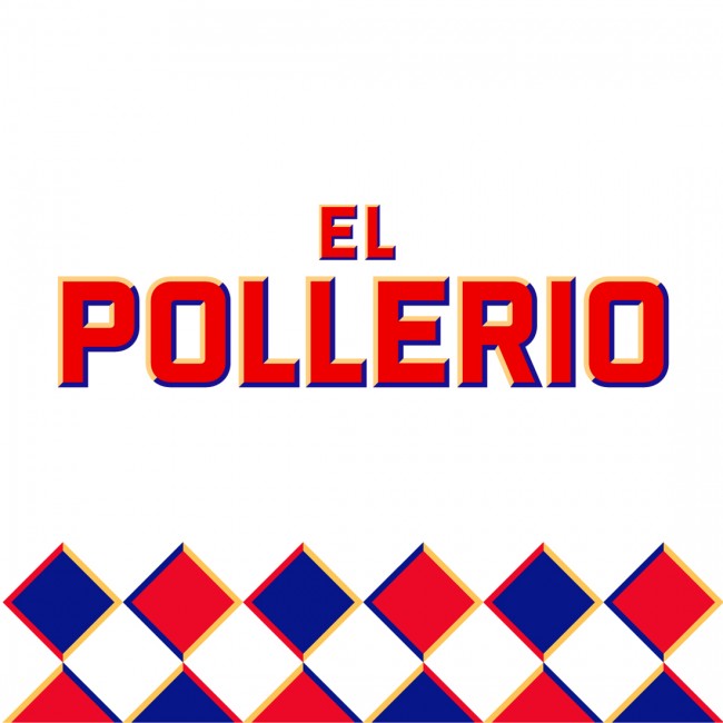
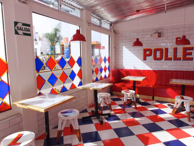
While TwoPoints.Net referenced tradition, sometimes the success of these kinds of identities depends on their ability to subvert it, like Peruvian chicken shop El Pollerio, a new fast food outlet that cleverly references the visual history of its competitors. Designed by IS Creative Studio, who say the brief called for something “fun, new, fresh, and simple,” its red, blue, and white harlequin pattern interiors are repeated on the restaurant’s print materials, and have been combined with satisfyingly chunky type. “I think color is like salt,” says the studio’s Richars Meza. “If you use too much it can became too aggressive, but if you use the right amount it makes a big difference. We used white walls and silver ceiling help to give more air and keep it fresh.”
Previously, the studio worked on equally refined branding for Caravana, another chain of Peruvian rotisserie chicken restaurants. Meza notes that often, for new restaurants, the costs of opening a location can be prohibitive, resulting in a lack of attention to design. However, he believes bringing in designers at the start of a new food venture is an essential part of its success.
“Brands should think that if they start day one with the designer, the concept can be more powerful. It’s not just about a logo and a menu, it’s about how the brand speaks in the very detail of thebusiness.”
While young food brands are forging ahead, it’s clear that bigger names are at risk of being left behind (even if McDonald’s seems to be making a late play for the design world). While newcomers to the business are intent on redefining the rules for the industry, a key ingredient of that change is putting design at the absolute heart of the process.