By Patrick Burgoyne 01/12/2008
The unscrupulous among the advertising community have often tended to look upon charity accounts less as an opportunity to help those in need and more as a chance to help themselves. Is a more mature approach emerging?
Charity campaigns have often been taken on with the express intention of winning awards and, in order to do so, many have resorted to crude tactics. In the mid-90s when outrage over ‘shock advertising’ was at its peak, some of the worst offenders were for small charities many of which, miraculously, were never heard from before or since.
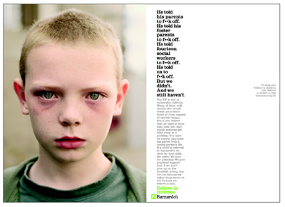
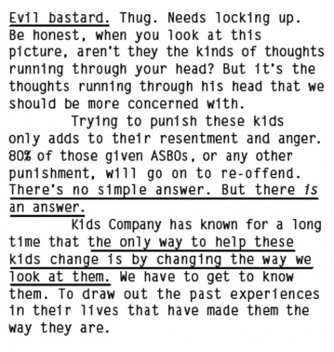
But perhaps there is something of a more mature approach emerging. Take, for example, recent print campaigns by This Is Real Art for Reprieve and AMV.BBDO’s new campaign for Camilla Batmanghelidjh’s Kids Company plus, from slightly further back, CHI’s Prince’s Trust work and BBH’s Barnardo’s campaign from last year.
The first thing that occurs with these campaigns is the amount of copy used. It’s not so long ago that we were all bemoaning the death of long copy in advertising. And yet all four campaigns use lengthy, discursive texts to make their case: in Kidsco, the copy runs to nearly 400 words. The style is conversational.

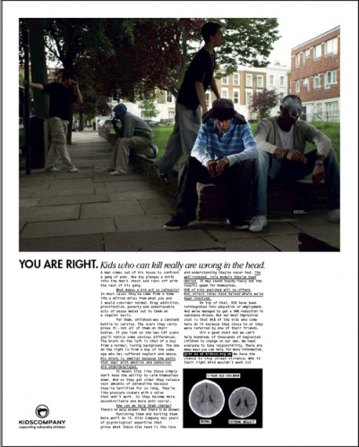
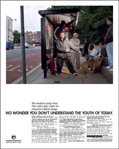
All four campaigns go for a factual, documentary style of layout, aping editorial or, in the case of Reprieve, the visual language of bureaucracy. The use of typewriter fonts in Kidsco (Letter Gothic Medium) and Reprieve reinforces the documentary feel.
Headlines have a similarly editorial look, even working with standfirsts in the typical language of a magazine spread, while the photography studiously avoids sensationalism, particularly Kiran Master’s shots for Barnardo’s. The Reprieve campaign even obscures its shocking imagery, letting our imaginations do the work.
The art directors for KidsCo (Paul Cohen) and for Reprieve and Prince’s Trust (Paul Belford) are noted for a more considered approach – one that seeks to reject the tired formulae of typical advertising art direction (big picture, punning headline etc).
These campaigns attempt to engage with the mind more than the heartstrings, patiently arguing a reasoned case instead of lurching into a stop-them-in-their tracks visual assault. It’s a welcome change.