By Patrick Burgoyne 30/09/2007
There are few advertising campaigns as renowned or as revered as that created for The Economist by AMV BBDO
The beautifully-written, white out of red lines have become a classic of the genre. But what’s this? A new Economist campaign, in black and red? Using illustrations? Is this the end of an era?
Well no, not really. A new, radically different campaign for The Economist breaks this month in the national press and on crosstrack posters, but it does not spell the end of the classic red and white ads, say AMV. Instead, the new campaign of seven ads will complement its classic cousin. “The success of the ‘white out of red’ campaign was based on the idea of feeling that you were a member of a club. This is an attempt to broaden the appeal of that club and engage with a new audience,” says AMV’s Paul Cohen, art director on the new campaign. “The Economist is not changing the magazine in any way but they do believe that there’s a new, perhaps younger, group who would be interested in it.”
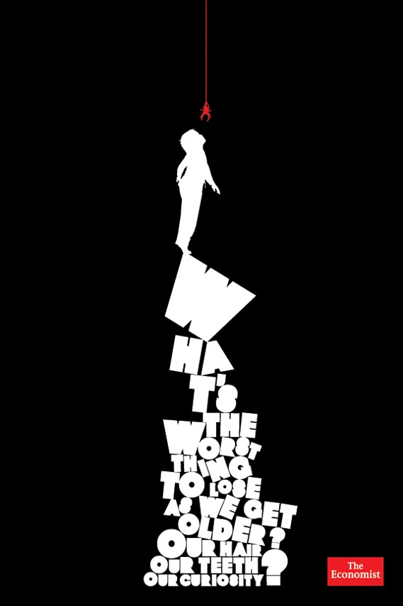
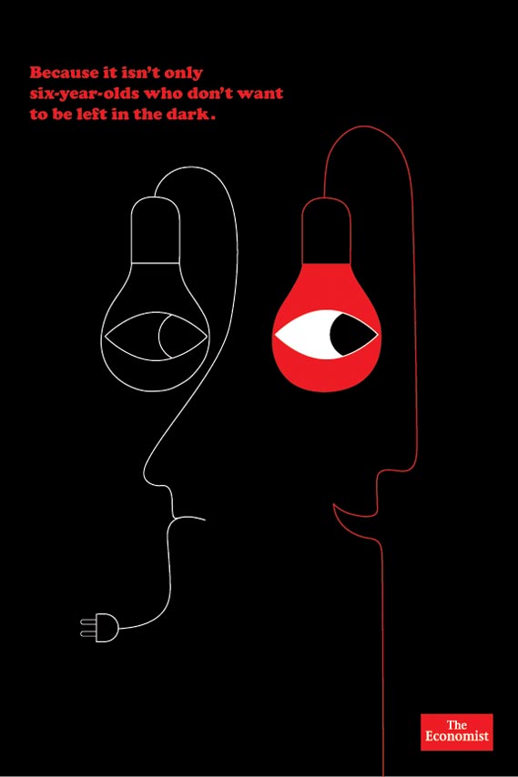
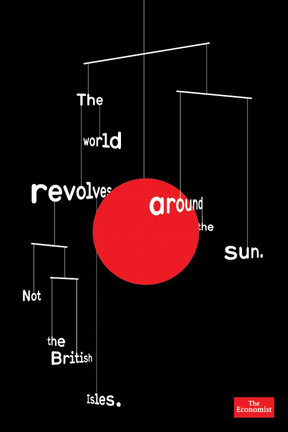
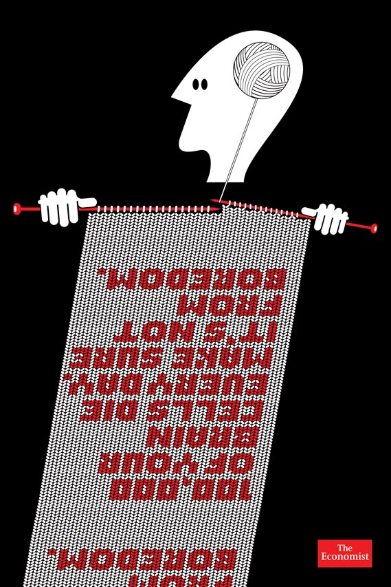
To engage this audience, Cohen commissioned six illustrators to interpret lines provided by copywriter Mark Fairbanks. “We tried very hard to avoid the prevailing styles or ticks of each illustrator, the look of each execution has come straight out of the line and what we’re using the line to say about the magazine,” says Cohen. “Though the illustrator’s hand is evident, everything is very pared down and works towards communicating the idea behind the line. I think this helps give the campaign a coherent feel. One that is as strong and identifiable as the white out of red ads.
“I think we’ve used illustration in a very different way to the norm in advertising in that there is an idea and a reward in the picture instead of just in the line,” he continues. “We put the lines out to the illustrators and left them to interpret them. We weren’t prescriptive. At no point did we say to them ‘can you draw us a…’ Advertising is sometimes a bit scared of working in this way but allowing the illustrators to think around a theme seemed a better way to use them. It feels more honest rather than being overly contrived.”
The illustrators chosen range from the old to the new: veteran US designer Seymour Chwast responded to the line “Looking for the herd? It went thataway” while Matthew Green, who was awarded a Commended in CR’s Creative Futures young talent competition last year, took on “Dissection: Good if you’re a story, bad if you’re a frog”. Non-Format created two ads, while the list is completed by Mick Marston, Fine ’n’ Dandy and Geoff McFetridge.
The new campaign will no doubt cause some eyebrows to be raised, especially when comparing it to previous Economist campaigns, but “it’s a different style of advertising,” argues Cohen. “Compared to the white out of red campaign, less of the puzzle is contained in the line. They are a bit more instantaneous but that’s not to say that they are cheap or easier in any way, they are just speaking to a group that is more visually engaged.”